Sunday, 25 April 2010
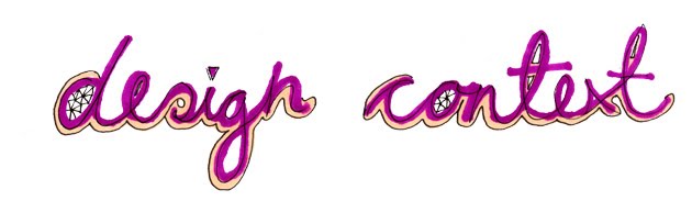
Mind Design
Belmacz Bauhaus Poster designed for the jewellery company Belmacz. The poster has angular geometric creases which create an abstract shape when folded together. It was sent out in a custom made angular envelope.


It has a nice concept to the piece as the custom jewelry has angular feeling to there designs, and so does the poster using geometric shapes and folding, combined with collage. This could be a new line of enquiry for my design practice to focus in on for the final weeks, geometric shapes.


.
Mike Crozier
Stop-motion film created for SNASK to promote them while he was on an internship in Stokeholm. What caught my eye was how Crozier has used paper craft to his advantage looking at folding and rips which add to the jiggery hand held movement of the camera which has been created using the indidviual stop frmes pieced together. Lovely piece of work.
Motion graphics and stop frame is an area which i would like to develop my skills further in, however it is far too late in the day on this course i would say for me to start and learn new software and i could spend more time learing how to use it than actaully doing it. Still i woudl like to use my paper craft and stop motion together in the further as i think the effect is creates is old fashioned and very beautiful.
SNASK from Mike Crozier on Vimeo.
Friday, 23 April 2010
Layout for publication
Proposed layout for the publication of my design context. it would be in a magazine format A4 or scaled up to A3 which would provide a more tactile feeling for the magazine which is in fitting with the theme of my work.
I want the layout to be playful, bright and colourful to reflect the nature of craft design:

Below, intro page on the right. the page would be cut into strips and layered for each chapter. As each strip is lifted for each different chapter and over view blurb is hidden underneath:

Layout for the inside interviews and spreads, for an example julian valle's below. Playful, bright and engagaing:


Example for the spread explaining the texhniqual side of set design of left:

Printed out mock up of the format:


Thursday, 22 April 2010
Pablo Alfieri / Playful Interview
As part of my case studies of freelance designers I chose to interview Pablo Alfieri. He works on 3D letter form and staged set design on smaller scales compared to Pixelgarten and Vallee - his work has been featured earlier on this blog. Here is response to the questions which i sent out:
Dear Lucy, sorry for the late reply.
and good luck with the studies!
Pablo.-
Means to do something analog, leave the computer, work with my hands, get fun and don\t worry about the perfection, because in this world The details on the imperfections are the key.Dear Lucy, sorry for the late reply.
and good luck with the studies!
Pablo.-
1. What does 'craft design' mean to you as a designer?
2. Do you think there are certain elements which digital design cannot
capture, which craft design can? Could it be argued that craft design
has more value?
3. Do you think your style of craft design represents your personality?
4. What is your material of choice and if your could work with any
material what would it be?
5. Before you start designing do you normally have a visualized idea
of what the final outcome will look like?
6. How long does it usually take to finish one project from start to
finish? What is the usual length of time you put aside for making the
sets?
7. What is the size & scale in which you work on when building a set?
8. For the final production, do you work in a team? Or take the
project from start to finish on your own?
Thank you for your time.
Behind the scenes imagery (Juillian Vallee)
Part of my publication will have an in depth line of enquirary examining how these stage sets are actually created. Looking at the precision, the intrique detail of hanging each individual piece, which i think can be sometimes miss read and pass by without the appreciation it deserves. Producing set design takes time and care and patience, it is a hard laborious process but however at the end when you have that shot it can also be the most rewarding in my opinion.
An example of the attention to detail which i will be investigating and exploring is Jullian Vallees work:


Seeing the teams and how many people are involves in each set from start to finish. Also extending this interest to exploring lighting techniques to camera perspective trickery - depending on what gives the viewer the best shot.


Background images..
Sample images whihc will be used in the magzine acting as backgrounds to the page spreads on a transpancy or simple sections will be cut out and positioned within the page spreads amongsht the text and designers work where appropritae.
I dont want the magzine to be a clean cut, minimal magazine with a nice clear grid and positioning. I will be using a losse grid but i will be working to reflect how i personally work, so i want the overall astehics of the magazin to convey my cut ans stick design practice and those of the other deisgners work. The layout will be playful and teasing - but still be asethically pleasing.


The problem which i think i will encounter when designing the layouts will be knowing when to stop, and to remeber that oftern little is more as i have a tendency to over crowd. There will be little type treatment and the main focus of the magzine will be on image.
Design sheets document ideas for the contents and introduction pages. I want the magazine to have parts cut away and some pages possibly folded over to fit in with my design practice. I am considering having the contents pages staggered away to reveal each chapter in sections:


Cropped sections
After looking through the shots which i had taken for the mock up front cover shots i actually prefer how some of the close up or edited cropped in section look compare to the final cover shot. I think they are more interesting and show detail of handmade letter form more effectively.


Close ups could be used for part of the cropped in background of layouts as well as the mock up backgrounds which i have produced below, or backgrounds for who double page spreads possibly.


Initial test shots for the cover design
Trailed actually using the large scale 3D letters in a set for a quick mock up to see how they would look for the cover design. When the real photo's are being taken i will consider space and provide a larger surface for working when positioning the letters as in some of the shots the letter are too cramped together as there was limited white paper for backing them.
However i am fairly pleased with them even though they are test shots - and i throughly enjoyed the process of making type on a large scale. Where as normally i design my sets in shoe boxes so on a much smaller scale. Here are some of the best shots:


However i am fairly pleased with them even though they are test shots - and i throughly enjoyed the process of making type on a large scale. Where as normally i design my sets in shoe boxes so on a much smaller scale. Here are some of the best shots:


Bellow is the shot which would be most apt for the cover currently. The cropping in of the hand holding the ON type is effective and conveys the title itself, in being 'Hands on'. Maybe for the future set i could include more hands, each holding th letter forms. This is something to defiantly be considered.
I particularly like the shots which are not clean cut, not all white and show some of development to how the set was erected. For example the black space at the bottom of the shot and the lighting being half cropped in - all i think are effective for conveying that set design is not as easy as it looks, that there is more to it.

Wednesday, 21 April 2010
3D type experiment
As my design context is currently about set erection and the process of using paper to create a 3d set and then taking ti back down to 2D it makes sense that for the frount cover i plan to make a set on a large scale. I wanted to reccreate a cover in the same style to what Pixelgarten did for there cover of Tactile and Jullien Valles Tangible cover design.
Both have similar features, with large bold 3D type with smaller paper objects which are random positioned around.


I started to play around with corrugated card as i thought this would provide a strong sturdy structure to my letter forms when mocking them up.
I didn't use a computer generated typeface but i may in my final set, instead i quickly drew my own typeface which i feel worked fairly well giving the letter forms the extra hands on, tactile feel.


Subscribe to:
Comments (Atom)