Thursday 3 June 2010
Wednesday 2 June 2010
The folding of final product
Once all the posters were designs and had been printed it was now time to do the folding, and i was praying that i wouldn't mess this up! Luckily it al went smoothly and i am very pleased with the final outcome:


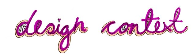
Layout of design context
I started the final layout and design for the double sided posters for my design context. As i have said previously, i wanted the layout to be playful and exciting fo the viewer and reflect my design practice:


My response for the combination of hand craft and digital design, i took the hand crafted collage which i have made a while ago at the start of the yeat but haven't previously used in in any of my deisgn work. I thought it would be relevant to enchance it in photoshop and then add digital vectors overlayed ontop which is rleevant to my current deisgn parctice:


Original scanned in collage:


For the final poster i wanted to have the cube made in mock up form being hand held. As this is placing my context within context as the title of my context is hand's on. Below sample shots of the cube being held:


Final poster image:

Tuesday 1 June 2010
Test Mock up of cube

As the posters which i am designing are A3 instead of a perfect square which i had only previously tested i thought before i print off the final designs i need to make sure the format is completely fool proof.


Assembled and all slotted together:


Perfect cube:

Sunday 30 May 2010
Design for Application poster
For the application poster, i want to demonstrated how craft design has been used to answer commercial briefs and its popularity within the contemporary design industry.
i decided t take a shot similar to my shot which i took for my year book page, ( high birds eye, angled shot) as it was effective and relevant as it would show off my work to its full potential in context. Th majority of my work is design for promotional material, and i successful apply my design process and style in answering these.
Then on the info side to the poster i will have imagery form designers such as Chrissie Abbot showing her application of her style to music promotion and Chrissie Mcdonald in a similar way.
Samples of set shots:

I tried to write the tittle in paper of the poster, however this was much harder than Vallee makes it look within his work. The paper folds didn't stay in paper and too much bending caused the paper to crease in the wrong way. So instead i tried using capitals instead of a swirling, joined up typeface:

This worked better but the overall effect i think actually looks a bit naff, so i decide to scar this idea.


I considered again similar to my year book shot - hand holding the cut out cardboard which would have the title written on, this would be photoshopped in for ease and time. However i have already done this, so i thought simply a nice shot would look more professional and do the set justice:

Set up of the shot:

Birds eye shot, taken standing on a stool. This was hard as i had to hold the camera at arms length to get a direct shot and took several times:

Final poster shot, simple and effective. As gives a slight illusion and conclusion to how the shot has been taken as it is only at the bottom of the poster you notice that im standing on the chair:

Subscribe to:
Posts (Atom)