Monday 19 October 2009
Saturday 17 October 2009
Wednesday 14 October 2009
Chrissie Abbott!!!


The image below has been used to promote the new up coming artist Little Boots. Demonstrating how this cut and stick style of design is very much in mode currently on the music scene/industry it is recognised.


I found this girls work on the YCN portfolios blog, her work is amazing and very similar to what i am already doing and what i am working towards. Over layed geometric shapes, changing the transparency with photocopied grey scale images below.
Thin line art entwinning and drawn in the shapes to add depth.
Martin Nicolausson
Window art from YCN

I came across this photo on the YCN blog last week, it is for the front of a pub/ club in Brixton London, who's twin venue is the newly opened Nation of Shopkeepers in Leeds.
I couldn't find the artist who designed it or installed it, however the idea is fun and simple a new innovative good way to fill window space! This is something which i would like to get into , 3D illustrations not necessary for shop windows, maybe adaptable so they could be though.
Olly Moss!!!


I was considering doing the Penguin book design cover brief, so i started looking at Moss's work. His work is simplistic, bold and colourful i particularly like his use of layout and simple shapes.
Using the colour scheme of generaly black and white and a spot colour - his designs are always effective and stand out from a mile. Moss's always pays attention to what the book is about, by either outlines or filled in objects which have a relevance to the story or title of the book.
masha karpushina

I came across these illustrations initially from after viewing Hayleigh's work. Karpushina's illustrations are intricate and detailed - fine lined drawings which swirl and flow with sometimes hand rendered text combined.
Her drawings are dark giving a sinister effect with some of the faces morphed, generally using only black line art. I could maybe incorporate this in my work over photographs linking collage together, playing around with stock.


Wednesday 7 October 2009
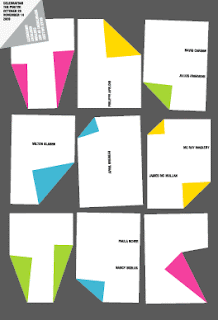
A collection of promo posters
Owen

3D work is part of my desihn practive which i am looking to devl into, I found this work on the ycn blog links. Owen recently created this fantastic image which appeared in The Guardian to coincide with the much anticipated release of exam results 2009.
I found it very eye catching using shadows and cut and stick approuch then scanned in, a technique which i would like to incorperate.
I want Design Ltd, again
Nous Vous


Leeds based small creative design agency regularly producing works for the local student venues around Leeds and recently more commerical work for the council which has caught my eye. Nice illustartion and type combined, limited use of colour is very effective.
I contacted them over the summer in enquiry's to a work placement and feedback on my portfolio, they said my portfolio was interesting however it covered a large spectrum and was too broad currently.

Thursday 1 October 2009
My new love -triangles
Tinhead
I Want Design Ltd


This company is based in London and are amazing the work is what has inspired me this year to focus in on geometric shapes within my collages and photography. I contacted them over the summer to enqiry if they could offer me a placement or any kind of experience and they sadly decline, only offering placements due to the large demand to over graduates. Here are samples of there works:
Subscribe to:
Posts (Atom)


