i decided t take a shot similar to my shot which i took for my year book page, ( high birds eye, angled shot) as it was effective and relevant as it would show off my work to its full potential in context. Th majority of my work is design for promotional material, and i successful apply my design process and style in answering these.
Then on the info side to the poster i will have imagery form designers such as Chrissie Abbot showing her application of her style to music promotion and Chrissie Mcdonald in a similar way.
Samples of set shots:

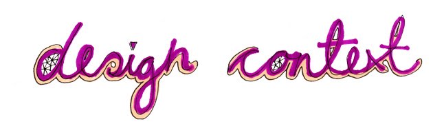
I tried to write the tittle in paper of the poster, however this was much harder than Vallee makes it look within his work. The paper folds didn't stay in paper and too much bending caused the paper to crease in the wrong way. So instead i tried using capitals instead of a swirling, joined up typeface:

This worked better but the overall effect i think actually looks a bit naff, so i decide to scar this idea.


I considered again similar to my year book shot - hand holding the cut out cardboard which would have the title written on, this would be photoshopped in for ease and time. However i have already done this, so i thought simply a nice shot would look more professional and do the set justice:

Set up of the shot:

Birds eye shot, taken standing on a stool. This was hard as i had to hold the camera at arms length to get a direct shot and took several times:

Final poster shot, simple and effective. As gives a slight illusion and conclusion to how the shot has been taken as it is only at the bottom of the poster you notice that im standing on the chair:

No comments:
Post a Comment