So I set out to have a whole day to make and direct the set design for the posters. this included all of the elements and whatever else i could get my hands on which would compliment the set. I firstly started to remake the word 'HANDS' out of card, but instead of using dingle cut out letters as this was time consuming when cutting out - to join the letters together to make the 3D word instead.
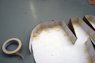
Here is what i started with. I first cut out the flat template for the word:

Started to add the sides to the letter forms to make the word become 3D:

I cut myself in the process:


Finished 3D word, free standing:
Making the apostrophe for the words:

Finished both words and joining elements:

I set up in studio three and arranged the paper elements which i had used in the past set mock up's for the cover designs. i just had to play around with composition and how the word would be read within the shot:

Underneath the words, 'Hands on'. i thought it was necessary to write the words 'craft' to explain to the viewer that the topic of the publication is about the application of hands on paper crafts. i trailed writing the word in different mediums, similar to the style Julian Vallee has used in many of his projects.
I was harder than it looks! To get the wires to stay positioned i had to tape them down - this ruined the loose hands free effect and it was not clear what it was meant to say. I tried using paper which was more effective, see below but still hard to get it to flow in the correct way:

Paper experiment:

I wanted someone to be physically holding the word 'hands on' as it reflect the word, it being hand held. So i quickly mocked up and tested to see if this would work:

It did work, however i thought more was needed in the set still so i went back to experimenting with the layout again:

Using Patrick and Vo as models when i was happy with the layout. i started shooting to test what the final cover shots would look like:


Edited photo's. As the format of the cube which will hold them in square format i had to crop the photos into squares ready to be place within indesign when ready:


The above shot is my preferred shot currently, however i do not think the photographs work well in square format and need more grey space either side of the frames. There is something missing from the shots, which leaves them feeling not complete.
It was also brought to my attention that the 'D' on the word 'Hands' was not readable so i would have to re shoot or photoshop this the cut out the centre part.


After this refinement i have decided to re shoot the set for the last time. i felt this was necessary as i dont want to give this project half measures, and why stop when your almost there - it only needs a bit more tweeting to the composition. Possibly add some paper to the floor space so there is less grey?


No comments:
Post a Comment