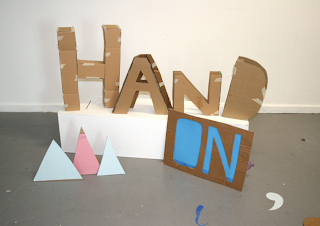
I used the 3D letter forms which i had previously made and used in the original mock up tester before out last context crit. I wanted to inproved the layout and positioning of the letters and include an individually physically holding the letters of the word, 'ON'.
Here are some of the shots:
Model Vo holding the letter H:
This wasn't working very well, it would be more effective it think if there were more hands in the frame and the models body wasn't on show. Cropping maybe be an option however not with the shots which i have now.
Below lighting experiments:
Not necessary or relevant really, as the lighting take away from the set design itself and the detail within it.
Cropped hand shots:
Im happy with these shots currently and i think the one above with Annad cropped out will be the best shot as it balances the composition. However if i get more time after finishing the rest of my projects i will revisit this and re shoot the set as im not 100% happy with it and it could still be improved.


No comments:
Post a Comment